Our Identity
Water Skills for Life visual identity has been developed to reflect our culture. The top element is made up of a child ‘tamariki’ appearing to float or dive in to the water, this represents the child’s life. The bottom element represents water but is also in the shape of a ‘Hei matau’ which in Māori culture represents strength, and safe travel across water.

Primary Lockup
We lead with our combined logomark as the hero of our identity. Our graphic icon represents our culture, and our name gives context to our purpose. We should always lead with this as a primary logomark. For social profiles, tighter spaces, or vertical layouts - we can use our icon only.
.75’’ or 50px
MINIMUM SIZE
This version is not intended for extremely small sizes. The minimum height is .75” for print applications and 50px for digital applications.
Clear Space
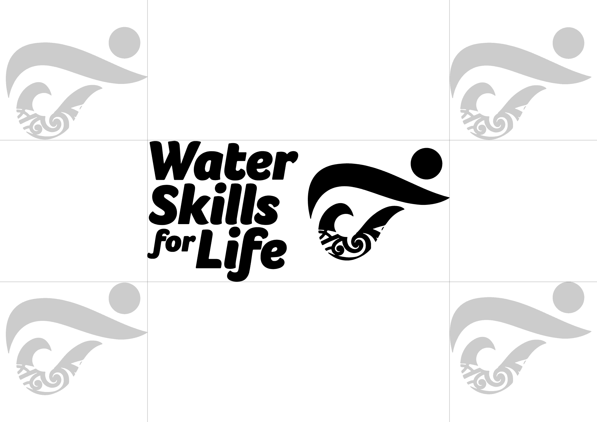
Clear space, or negative space, is the area that surrounds the logo that is completely clear of any other graphical element. Clear space helps the logo stand out from the rest of the elements on the page and ensures legibility, even at small sizes.
As a general rule, the more clear space around the logo, the better. If you need help applying the correct clear space, use this diagram and the relative size of the graphic icon as a reference guide.
Color Variations
The primary colours of the Water Skills for Life identity take cues from our nations waterways. These colours have been chosen to represent the authenticity of our culture and brand.
"Wairoa" (blue) is our primary brand colour, and is a representation of the streams and rivers that connect our waterways.
"Rotokākahi" (green) takes inspiration from the tapu (sacred) lake in Rotorua, which holds special significance to Te Arawa iwi that gifted the whakairo in our logo. The usage of this colour represents our connection to lakes.
"Tuna" (off-white) is our primary neutral. It reflects the whitewater and splash of the waves in our oceans. This is the colour you should use when placing the logo on top of imagery, or when using the logo on dark backgrounds. You can also use this as a background accent colour to draw attention to key information.
"Pango" (black) - should only be used on white or light backgrounds. We never use our logo in black on top of any imagery or colours.
Icon Only Lockup
The icon-only logo lockup for Water Skills for Life is our tamariki and Hei matau without the words. It should be useful in situations where the wordmark lockup cannot be scaled appropriately. It can be used alone or in combination with the primary wordmark where space permits.
Logo Misuse
This page illustrates how not to use the Water Skills for Life logo. These examples represent some of the most common errors, but do not necessarily constitute an exhaustive list. To maintain consistency of the Water Skills for Life logo, follow the guidelines outlined in this document.
Never attempt to alter, redesign, or add to the Water Skills for Life logo lockup.
Do not change the logo color outside of the approved palette.
Do not apply a gradient or pattern fill to the logo.
Do not outline the logo.
Do not stretch, distort, or warp the logo in any way.
Do not crop or cut off the logo.
Do not change the typeface or recreate the Word mark.
Do not rotate the primary or icon versions logo.
Do not add a drop shadow or any other effect to the logo.
Do not position the logo over off-brand colors, patterns, or busy backgrounds.
